In today's digital landscape, your website needs to perform flawlessly across all devices. This comprehensive guide explains responsive web design, why it matters, and how to implement it effectively.
What is responsive web design?
Responsive web design refers to creating websites that automatically adapt to look good on any visitor's device. With this approach, your website's content, media, and elements remain consistent, readable, and accessible whether viewed on a mobile phone, tablet, or desktop computer. The magic behind responsive design includes fluid layouts, CSS media queries, a single codebase, and flexible media elements.
Why responsive design is essential, not optional
Responsive design isn't just a nice feature—it's absolutely necessary for modern websites. Here's why:
Google uses mobile-first indexing, giving responsive sites a better chance at higher rankings. Users get consistent displays across all platforms, making for a better experience. Well-designed, responsive sites appear more trustworthy, leading to more conversions. When sites look good on all devices, users stay longer and bounce rates decrease.
Have you ever visited a website and got excited to see elements out of frame or not properly loading? Not at all. You and your users want websites optimized for whatever device they use to access the site.
Responsive design vs. Adaptive design
Though both approaches aim to optimize user experience across devices, they work differently.
Responsive design uses fluid layouts that resize based on screen dimensions, employs CSS media queries to adapt to different devices, and operates from a single codebase.
Adaptive design creates fixed layouts for specific screen sizes (320, 480, 760, 960, 1200, 1600), uses user-agent detection to identify devices, and requires multiple codebases for different layouts.
You should use responsive design when you want consistent user experience across devices, prefer easier maintenance and updates, prioritize mobile optimization and SEO, or want to reduce design costs.
On the other hand, adaptive design makes sense when you need hyper-tailored functionality for specific screen sizes.
Understanding screen sizes
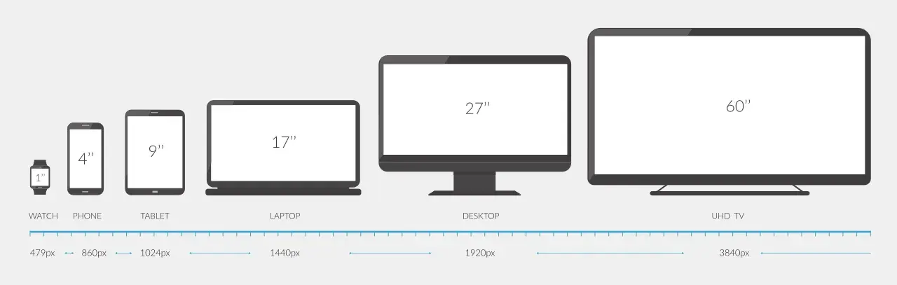
(Image Source: Inch Calculator)
Screen size refers to a device's diagonal length, typically measured in inches or aspect ratio. Equally important is screen resolution—the number of pixels that make up a display (like 360x800).
Size matters in responsive design because it determines how your content is displayed and how users interact with it. Poor design for certain screens forces users to zoom in/out, likely driving them away. Different screens also require different approaches to highlight crucial information.
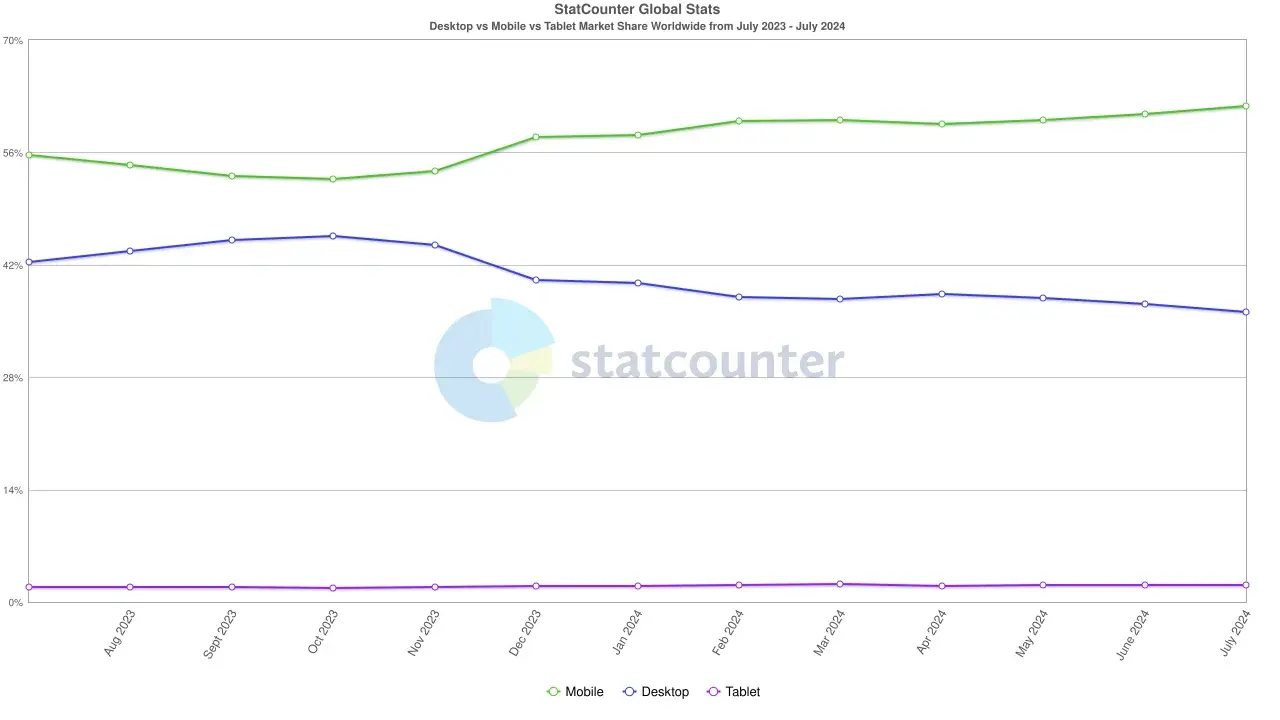
(Image Source: Statcounter)
Mobile devices currently hold 61.74% of the worldwide market share, so ignoring smaller screens means turning away a considerable number of potential visitors.
Common screen sizes you should know
When designing responsive websites, you should be aware of the common screen sizes across device types.
For mobile phones, the most common resolutions include 360x800 (Samsung Galaxy S21) at 11.28% of mobile screens, 390x844 (iPhone 12) at 6.9%, and 393x873 (Google Pixel 6a) at 5.57%.

(Image Source: Statcounter)
Tablet screens commonly feature resolutions like 768x1024 (iPad Air 2) making up 21.89% of tablet screens, 810x1080 (iPad 10.2) at 11.31%, and 820x1180 (iPad Air 10.1) at 7.5%.

(Image Source: Statcounter)
Desktop screens typically show resolutions of 1920x1080 (Asus VG245H) accounting for 23.37% of desktop screens, 1366x768 (Acer Chromebook 315) at 12.54%, and 1536x864 (Dell E2318H) at 11.59%.

(Image Source: Statcounter)
Remember to consider both landscape and portrait orientations when designing for mobile and tablet screens.
Coding for different screen sizes
CSS media queries are the backbone of responsive design. They allow your website to display differently based on screen size.
The basic syntax looks like this:
p {
  font-size: 16px;
  color: black;
}

@media (max-width: 600px) {
  p {
    font-size: 14px;
    color: blue;
  }
}
The first part sets paragraph text to black at 16px for all screens, while the second part changes it to blue at 14px when screens are 600px or smaller.
You can use different media types when making CSS queries. The most commonly used ones are "all" (suitable for all devices), "print" (for adjusting layout when printing), "screen" (for computers, laptops, tablets, and mobile devices), and "speech" (for screen readers).
Example: Creating a line break for different screens
Here's how to code a line break that works differently depending on screen size:
<p class="responsive-text"> This is a long sentence that will break into two lines on small screens but stay on one line on larger screens.</p>
When testing, you'll see the difference in how the text appears on different screen sizes:
On larger screens (like desktops or laptops), the text stays on one line:

On smaller screens (like phones), the same text automatically breaks into multiple lines for better readability:

This simple example demonstrates the power of responsive design. The content remains the same, but its presentation adapts to provide the best experience on each device.
If your code doesn't work right away, keep testing and refining until you get the desired result. Sometimes small adjustments to your CSS media queries can make a big difference in how your content displays across devices.
Make your websites responsive
Creating a responsive website isn't optional anymore—it's crucial for providing seamless experiences across all devices, improving SEO, and maximizing engagement. By understanding responsive design principles, using CSS media queries effectively, and continuously testing your designs, you can create websites that look and function beautifully on any screen size.